Note: since I migrated away from WordPress for my main website, I don’t plan to maintain this plugin anymore, but I am now using a revamped version designed for integration with Hexo. It reuses a lot of the same CSS and generates similar markup.
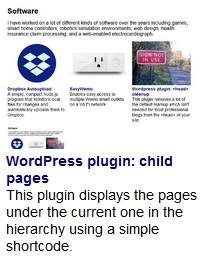
During my previous website redesign in WordPress, I was looking for a way to easily display all the pages directly under the current page in the hierarchy, and I couldn’t find one. This plugin does that, displaying page thumbnails and excerpts for a list of results that can easily be styled in different ways. It adds a shortcode, list-child-pages, which can be used in any page to display the list and is customizable with the following parameters:
- container_element: the element to use as the wrapper for the entire list (defaults to ‘ul’)
- container_id: the desired ID for the container element
- container_class: the desired class for the container element
- item_element: the element to use for each page (defaults to ‘li’)
- item_class: the desired class for each item element
- thumbnail_element: the wrapper element to put each thumbnail image in (defaults to ‘div’, unused if display_thumbnails is false)
- thumbnail_class: the desired class for each thumbnail wrapper
- text_element: the element to wrap the text portion of each result in (defaults to ‘div’)
- text_class: the desired class for each text section wrapper
- title_element: the element to use for each page title (defaults to ‘div’)
- title_class: the desired class for each page title
- excerpt_element: the element to use for each page excerpt (defaults to ‘div’)
- excerpt_class: the desired class for each page excerpt
- link_titles: whether to display links in the page titles (defaults to true)
- link_thumbnails: whether to display links on page thumbnails (defaults to true, but unused if display_thumbnails is false)
- display_thumbnails: whether to display page thumbnails (defaults to true)
The end result when you use the shortcode is a structure like this:
<ul id="container_id" class="container_class">
    <li class="item_class">
        <div class="thumbnail_class">
            <a href="..."><img src="..." /></a>
        </div>
        <div class="text_class">
            <div class="title_element">
                <a href="...">Page title here</a>
            </div>
            <div class="excerpt_class">
                Page excerpt here
            </div>
        </div>
    </li>
</ul>
The reason I chose this structure is because it’s very flexible from a styling standpoint. Here is the same page preview styled different ways:

Large screen style, with a larger thumbnail and designed for a grid layout.

Small screen style, with the thumbnail to the side, designed for a single-column list. This layout is also reminiscent of search results if you’re going for that look.
